
Showing posts with label Construction. Show all posts
Showing posts with label Construction. Show all posts
Monday, 17 April 2017
Main Task: Production Company
I have included the production company name as the music video finishes, "HHProductions", as this is a common feature I have seen at the end of many famous, proffessional music videos. It only stays on the screen for a matter of seconds however it give the audeince an insight into who has helped create the video and where the music and artists are coming from. The font is very plain and it is located in the centre at the bottom of the screen. It is a dicrete feature however it fits it's purpose.

Saturday, 15 April 2017
Main Task: Fade to white
My choice to fade the video to white, once the song finishes, from the panning up shot of the sky was because it gives the effect that the eye would see when looking directly into light. This puts the audience into the perspective of someone who's just watched all the events take place first hand, as if they were really there, seeing it through their eyes. Also I chose white over fading to black as the colour white can be used to represent a "successful beginning' which is exactly what the narrative closes with, a new start in the relationship.


Wednesday, 12 April 2017
Main Task: Megan's Escape
I have included clips in my music video of Megan by herself surrounded by nature e.g. running through grass fields and walking near a stream. This is to represent her escape from drama both mentally and physically when she is going through difficult times in their relationship. I decided to use these clips, also, to create another dimension to the narrative that my audience can relate to as we all have a place we go either in our minds or physically to escape drama and/or negativity.
Clips that don't feature Megan but include the stream, trees and fields also contribute to the representation of her escape/sanctuary.


Clips that don't feature Megan but include the stream, trees and fields also contribute to the representation of her escape/sanctuary.


Thursday, 6 April 2017
Main Task: Footprints in the sand
During my music video, I have included a close up shot of Megan's feet taking steps on the beach, however the clip is reversed. My choice to put the clip in reverse was to present the reliving of their relationships past and whether moving forward with the relationship is a good idea or that they should give up. I wanted to highlight aspects of their relationship that are all very relative to real relationships but using symbolic techniques rather than through obvious methods such as, for example, clips showing my actors looking through old photos.


Wednesday, 5 April 2017
Main Task: Split Screen
I chose to use the Split Screen effect as I wanted to portray the idea of my actors crying out that they are both feeling lost and confused. This contributes to the narrative to show a moment in time where they are both feeling just as vulnerable as each other and are allowing the audience to see this. (In the reality in which the music video takes place, I intend for it to seem as though this would be the time they would be telling people how they are feeling about their turbulent relationship, and seeking advice. This is reflected by how the actors are singing directly into the camera.)


Monday, 3 April 2017
Main Task: Lyrics
The lyrics of the song "Let it all go" work well with the way I have filmed and created my narrative around the song itself. It is a love song that captures the idea of overcoming problems within a relationship e.g. "But if we're strong enough to let it in." "We're strong enough to let it go.". It suggests that the relationship being sung about is turbulent and has it's ups and downs e.g. "Who says love should, break us if we fall", which I believe I have portrayed well through my music video as I include clips that show, my actors, in both positive situations such as laughing together and visibly enjoying each other's company but also in arguments and during times where they are clearly not seeing eye to eye such as where we see Megan hang up a call on Alex after lip syncing the lyrics "I've been waiting on you, just to say something real".
Saturday, 1 April 2017
Main Task: Fireworks
My choice to use the clips of fireworks during the music video was to represent two key aspects of the relationship. The first shot is of the fireworks going off. This was to show the chemistry that is being felt between the two actors and the prospect of new starts each time the two reconcile. The second is of the fireworks clip reversed. This takes place just before the two actors are shown walking valiantly towards each other on a beach. I chose to place it there as it portrays the feeling of reality setting in and the realisation that, each time they feel the "fireworks", they can't be without each other. This is why the walking shots follow.
Despite fireworks included in a love story narrative being seen as a "cliche", I believe I have used the feature tastefully and stylistically to contribute to the narrative that can be taken seriously.

Despite fireworks included in a love story narrative being seen as a "cliche", I believe I have used the feature tastefully and stylistically to contribute to the narrative that can be taken seriously.
Main Task: Over the shoulder shot
The significance of the over the shoulder shot, where we see Alex looking at his phone and calling Megan, is to allow the audience to feel like they are involved in the story from the outset, as the shot takes place at the beginning of the video. This particular shot breaks a certain barrier between actor and audience as it gives them a view from the perspective of the actor which it is not a usual occurrence in reality. Furthermore, this will continue to intrigue the audience as to what will occur during the narrative.


Thursday, 30 March 2017
Main Task: Lip Syncing Improvements
When filming my music video, I was sure to have my actors over exaggerate when lip syncing as it looks extremely effective when the track is put over the top and the clips are complete. I have learnt from my pre lim task that if the actor is to mime the lyrics with naturalistic mouth movements then it doesn't look as though they are really singing.
Tuesday, 28 March 2017
Main Task: Syncronised Hug
The significance of the syncrinised hug shots that I use in my music video is to further solidify the narrative and show that these two people in a relationship always end up coming back together and rekindle their love for each other through ups and downs. I have the clips run into each other to create a flow of movement and intrigue the audience.


Sunday, 19 March 2017
Main Task: Promotional Advert
For my promotional poster, I have been able to incorporate a lot of the Album artwork as well as photos from my actual music video in order to have a clear running theme throughout all of them, that my audience will be able to clearly recognise and make links between them.
The significance of the rose is a large part of the overall album, music video and the artists. On the poster I have used petals falling for my background and placed all other features over the top so that there is a always a significance to that symbol of love.

I have slightly strayed away from my initial idea as to how I would like my Poster design to be as I said at first that I'd said I would like a scattered photograph design. Instead, I have in kept with the photograph idea however, I simply have 3 in a line placed in the centre. The two photo's on the left and the right side have photos (From my music video) of trees, one taken in a summery looking time period (referencing to the brightness of the light source and the leaves on the trees) and the other, winter (referencing to the evening blue light and lack of leaves on the trees). This is too show a definite passing of time.

The polaroid style photo placed in the centre is the photo used on the album cover of both of my actors facing each other with the light of a sun set shining through the middle.

The layout symbolises how the relationship between the actors has progressed and is clearly a long term relationship, which shows the relevance of the photos of the trees on either side of the photo of my actors.
I have also included the name of the musical duo/band "Leap Of Faith" and album name "Let It All Go", using the same exact font as I have used for my album. This shows continuity of the album's theme and a professional, recognisable look for the audience to connect and relate to. I have used the colour white for the text as it stands out well against the black of the background and red rose petals and this is the colour used on the album also.

I have used a feature that I have seen on real album posters which is mentioning the recent single released from the album and also mentioning that it's their debut album. I have used a mid-grey colour for this text as it doesn't need to stand out as much as the album name and band name. However it is still eye catching and works well against the background. The font is also a lot smaller than the name of the album and band so it does not overwhelm the poster and draw attention away from more poignant features e.g. the photos.

The month and year that the album will be released is also featured as this is an aspect I've seen on other posters and believe it adds to the overall suspense and interest in the album. It is the same font and colour as the name of the album and band.

I've also included the name of the production company "HHProductions" placed in the centre at the top of the poster in white.

My Completed Music Poster:

The significance of the rose is a large part of the overall album, music video and the artists. On the poster I have used petals falling for my background and placed all other features over the top so that there is a always a significance to that symbol of love.

I have slightly strayed away from my initial idea as to how I would like my Poster design to be as I said at first that I'd said I would like a scattered photograph design. Instead, I have in kept with the photograph idea however, I simply have 3 in a line placed in the centre. The two photo's on the left and the right side have photos (From my music video) of trees, one taken in a summery looking time period (referencing to the brightness of the light source and the leaves on the trees) and the other, winter (referencing to the evening blue light and lack of leaves on the trees). This is too show a definite passing of time.

The polaroid style photo placed in the centre is the photo used on the album cover of both of my actors facing each other with the light of a sun set shining through the middle.

The layout symbolises how the relationship between the actors has progressed and is clearly a long term relationship, which shows the relevance of the photos of the trees on either side of the photo of my actors.
I have also included the name of the musical duo/band "Leap Of Faith" and album name "Let It All Go", using the same exact font as I have used for my album. This shows continuity of the album's theme and a professional, recognisable look for the audience to connect and relate to. I have used the colour white for the text as it stands out well against the black of the background and red rose petals and this is the colour used on the album also.

I have used a feature that I have seen on real album posters which is mentioning the recent single released from the album and also mentioning that it's their debut album. I have used a mid-grey colour for this text as it doesn't need to stand out as much as the album name and band name. However it is still eye catching and works well against the background. The font is also a lot smaller than the name of the album and band so it does not overwhelm the poster and draw attention away from more poignant features e.g. the photos.

The month and year that the album will be released is also featured as this is an aspect I've seen on other posters and believe it adds to the overall suspense and interest in the album. It is the same font and colour as the name of the album and band.

I've also included the name of the production company "HHProductions" placed in the centre at the top of the poster in white.
My Completed Music Poster:

Thursday, 16 February 2017
Main Task: Audience
I used social media e.g. facebook to gain audeince feedback during the creation of each task. I found this to be really useful because I will have a biased view towards my work because I'm very proud of it, it is worth having a second opion to see my work from different perspectives.
I also did a class survey to determine which version of my advert was best and that I would use.


OR
I also did a class survey to determine which version of my advert was best and that I would use.


OR
I ended up using this one as both I and my audeince believed that including the additional photos really made it more eye catching and interesting.
Sunday, 12 February 2017
Main Task: Completed Digipak

This is my completed digipak.
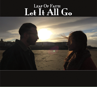
For the front cover I have used a very simple and yet effective design that features a photo of my actors looking at each other while the sunset shines through the space in the centre of them. This makes my actors look like silhouettes but still possess some features that define what they look like e.g. faint colours of costume, hair. I have used black borders at the top and bottom of the photo to enhance the effect it has on the audience as it looks as though there has been a snapshot taken of a poignant moment during their life/relationship. This will be a contributing factor in the initial attraction to the album for the audience. The name of the album, "Let It All Go", and the name of the band/vocal duo, "Leap Of Faith", are located in the centre of the top black border. I believe this was a perfect place as it doesn't overwhelm the cover, nor does it go unnoticed or can't be seen. I chose white because it will stand out against the black background. The font I have used for the front cover is used throughout my album to show clear continuity and portray a professional look.
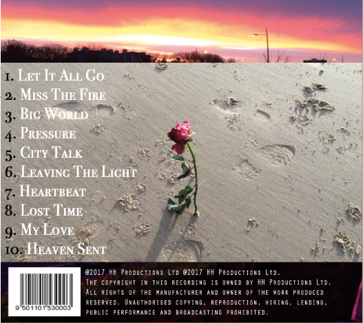
The back cover of the album case has a similar design layout with border at the top and bottom of the main image. However, for this cover I have used an image, that also appears in my music video, of a rose stuck in the sand of a beach surrounded by footprints. The rose is a motif that appears throughout my music video, representing love and hope, and album art as it is a symbol many people from many different places can relate to. The borders that surround the photo however are parts of a second photo that also appears in my music video, of a sunset. The sunset can be seen in the top border and the ground can be seen in the lower where the barcode is located as well production policies and tags. This is a feature I've seen on many real Album cases and wanted to emulate this on mine to aid me in creating a very professional case. I have used white for the colour of the text as it stands out against the border. I have used the colour black for the numbers listing the songs and white for the names as I believed using just one colour didn't stand out or look as effective against the sand on the main photo.
The inside cover of the Album includes a "Special Thanks" note from the artists which I have seen as a feature within other real album cases. The background is black with a falling rose petal pattern (the motif) that is seen throughout the video, poster and CD case.

The image that will be located behind the CD is of an image that can be seen during my music video of a panning shot of trees during the winter months. I believed this was a good choice as it is subtle, doesn't overwhelm the case and is relevant to the video and music.

Tuesday, 7 February 2017
Main Task: Digipak Update

Here are my Front Cover and Back Cover of my Digipak. I have not yet put the text on the back cover, listing what songs are featured on the album/single. I have included a barcode on the back cover as I have noticed that it is usually a key feature on a Digipak.
Wednesday, 1 February 2017
Main Task: My Digipak

Front Cover
For my Digipak I will be using a photo I took from when I was out filming with my actors (Megan and Alex) that I wanted to keep as I absolutely loved the way from the beach the sun broke through the clouds created silhouettes of Megan and Alex. It's a very simple image but it works so effectively.As opposed to using solely this image, I will use black borders at the top and bottom of the image to make it really stand out. These boarders will also allow me to put text at the top and bottom of the case which means I won't be covering any of the main image.
Back Cover
I will be using another image from the music video that I believe will really capture the kind of aesthetic I want the music and album to portray and is a very poignant motif that appears in my "Let it all go" video several times, representing love and hope for love.

The same way I will be using black border for the front cover of the album, I will be using borders on this image also, however instead of black I will be using a photo I had taken of a sunset that will incorporate the colour of the sky with the colour of the pink/red rose.
Inside Left and Inside Right
I have yet to decide what images will go on each side of the inside of the case.
Monday, 30 January 2017
Main Task: CD Digipak
A key feature that comes with having a music video, and potentially an album of music, is a digipak. The digipak is used to promote the artist, music, be eye catching for potential buyers and create interest. By having a digipak this allows me to have a well rounded look/image for the song as well as the artists by tying each quality and aspect of the music video in with my digipak design regarding colour scheme and layout.

This is the original front cover for the real single "Let it all go". I really like the simplicity of the cover however I'm potentially thinking of having my artists on the front cover or featured in at least the sleeve inside the case.


These are a few album digipak's that I particularly like and would like to take inspiration from when creating my own digipak.
I really love the kind of muted and pastel colours that are used against or acting as the background for some black silhouettes or darker shapes.
I would like to adopt a style similar but use my own unique ideas to create a really aesthetically pleasing digipak that will attract an audience to buy the album/single.
Main Task: Music Poster/Advert
Another aspect of releasing an album/single is having a promotional advert/poster to attract an audience make sure your album is constantly being promoted in the public eye. Here are a few examples of posters I have found promoting both albums as well as music videos.


I think my examples give a good outlook as to what kind of posters are out there, some being simplistic and others being quite busy and bright. Both looks are equally as eye catching and draw you in so I am yet to decide what kind of look.
My initial idea for my poster is to have a collage of screenshots from the music video in a scattered photograph collage style in order portray to audience an insight/first look at what the video will contain and what the narrative may be.
Saturday, 21 January 2017
Main Task: Costume Changing- Passing Time
I decided to make sure there were changes of costume, makeup and hair throughout my music video in order to show a clear chronological story line as well as a passing of time to show how the relationship my two actors were portraying was long term and and had been accustomed to real life up and downs. The colours of the costumes and style were all associated with the time of year in which my music video was set (Autumn/Winter) in order for it to be visually appealing and aesthetic for the audience.


Thursday, 19 January 2017
Main Task: The Rose
The relevance of the reoccurring red rose in my music video is to show throughout the somewhat turbulent relationship, the significance of their true love that above all, conquers. A red rose is a traditional symbol of love and therefore I saw it to be a key feature of my music video. Although at times the featuring of a red rose in a music video revolving around a relationship, can be extremely cliche and almost cringe worthy, I've used it in a stylised manner where the rose is simply the only thing in the shot and is never actually handed to either actor by one another to "show' love. It is loosely used throughout my video in order to refrain from bombarding or overwhelming the audience with one vision of love being represented throughout the video.


Subscribe to:
Posts (Atom)